
Custom maps in PRTG Network Monitor are one of the most powerful features for visualizing your network’s health in real time. Whether you’re monitoring a single site or a complex multi-branch topology, custom maps allow you to create tailored dashboards that display exactly the information you care about — live.
In this guide, I’ll walk you step-by-step through how to create a custom map in PRTG, including screenshots to make the process easier.
🧰 What You’ll Need:
- A working PRTG instance (local or hosted)
- Admin access to PRTG
- Network devices already added and monitored
- Basic idea of what you want to visualize (e.g., switches, routers, firewalls, links)
🗺 Step 1: Log In to Your PRTG Dashboard
- Open your browser and navigate to your PRTG instance.
- Log in using your credentials.

🧭 Step 2: Navigate to Maps
- From the main menu, click on Maps.
- On the Maps overview page, click Create Map.

📝 Step 3: Set Up Basic Map Information
You’ll be prompted to enter the following:
- Map Name: e.g., Main Office Network
- Map Width & Height: You can use default values or set your preferred canvas size.
- Auto-Refresh Interval: Recommended: 30–60 seconds
Click Create.
🧱 Step 4: Start Building the Map Layout
You’ll see a blank canvas and a toolbox on the right with Map Objects. These include:
- Devices
- Groups
- Sensors
- Status Icons
- Traffic Gauges
- Custom HTML/Images
Add Devices/Sensors:
- Expand the Devices tree and drag & drop your desired device or sensor onto the canvas.
- Use Sensor Gauges, Graphs, or Status Icons to show live values.
Example Layout:
- Core router in the center
- Branch office switches on left and right
- WAN link sensors with traffic gauges
- Firewall CPU/Memory sensors with pie charts

🔐 Step 6: Set Map Access Permissions
Once your map looks good:
- Click Map Settings
- Under Access Settings, choose:
- Public (anyone with the link)
- Private (PRTG users only)
- Password protected (for restricted external access)
You can also enable Read-Only mode to avoid accidental edits.
🚀 Step 7: Save and Share Your Map
Once finalized:
- Click Save
- Copy the Map URL and embed it in your NOC display or dashboard.
- You can also set it as your PRTG homepage or share it with your team.
🧠 Pro Tips for Better Custom Maps
- Use color coding (e.g., red for down devices, green for up) to visually detect issues.
- Group related sensors (e.g., VPN tunnels, WAN links) for better visibility.
- Use live graphs for bandwidth and CPU over time.
- Update maps periodically as your network grows.
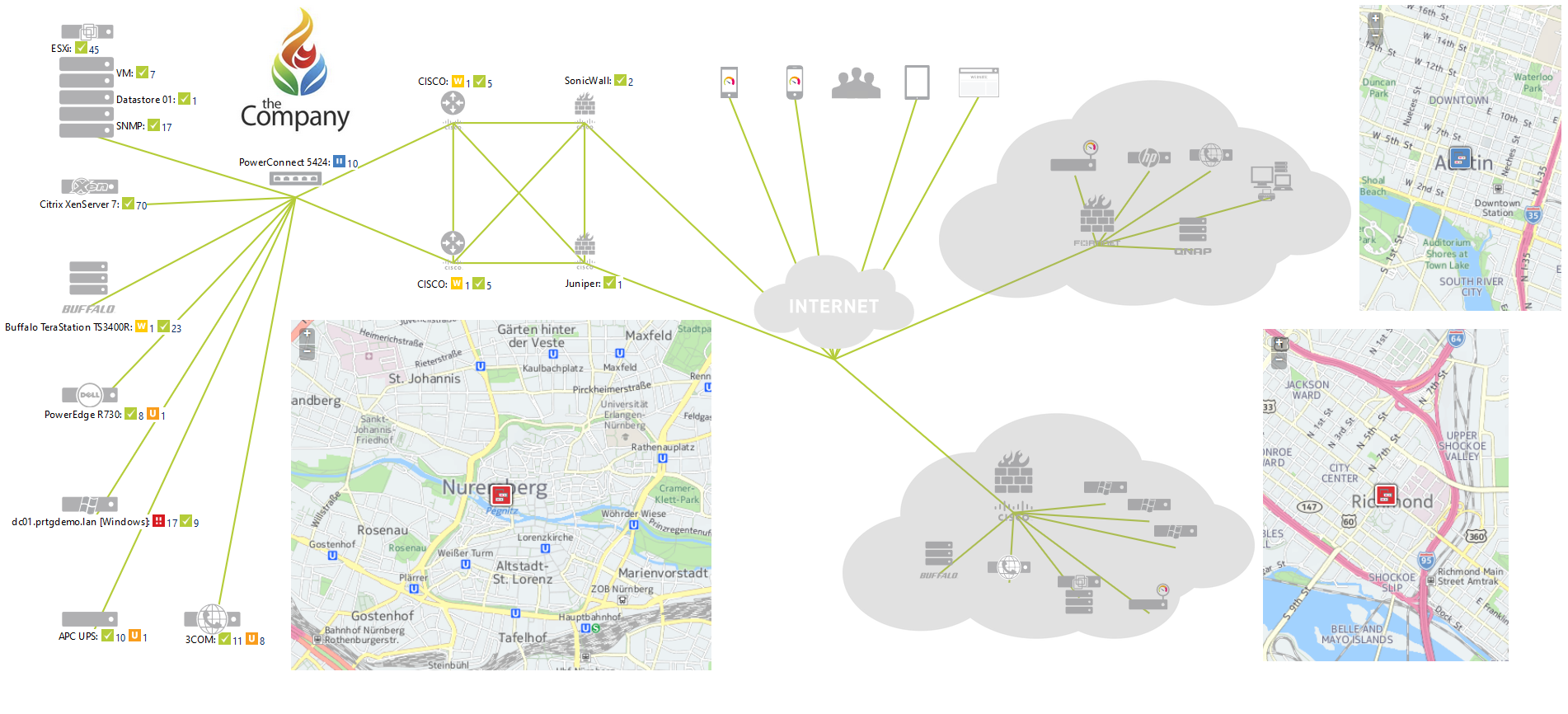
🖼 Example: Simple Network Map

🔚 Conclusion
Custom maps in PRTG allow you to create real-time, visual dashboards that are not only functional but also easy to understand at a glance. Whether you are monitoring data centers, branch offices, or a hybrid network, custom maps help you reduce MTTR and proactively manage your infrastructure.
Have you built your first map yet? Let me know your experience in the comments or drop me a message.
Happy monitoring!
– Zubair